-
Topics
-
-
Posts
-

By john william · Posted
Welcome to Eastern Laptop Repair – your go-to destination for all your computer needs in Las Vegas. Our skilled team is dedicated to providing top-quality services that surpass expectations. We understand how important computers and laptops are in your daily life, whether you're a student, professional, or casual user. When your device isn't working correctly, it can bring everything to a halt. That's why we're here to offer comprehensive solutions to get you back up and running quickly. Our shop offers a wide range of services beyond just laptop repairs. We're a one-stop shop for desktop computer repair, printer troubleshooting, and even specialized assistance for gaming PCs. Our Apple-certified technicians ensure your MacBook's receive the care and attention they deserve, maintaining their sleek performance. What sets us apart is our commitment to quality and customer satisfaction. We use the latest diagnostic tools to accurately pinpoint any issue, ensuring our repairs are precise and long-lasting. Our technicians follow industry best practices and refer to official repair manuals, executing every repair with the utmost care and expertise. -
 optimal spacing for double-sided cabinet light LEDs is crucial for balanced illumination. Consider factors like cabinet size, desired brightness, and placement to ensure even coverage. With careful planning and precise spacing, you can enhance visibility and ambiance, creating a well-lit and inviting space for any setting.
 -
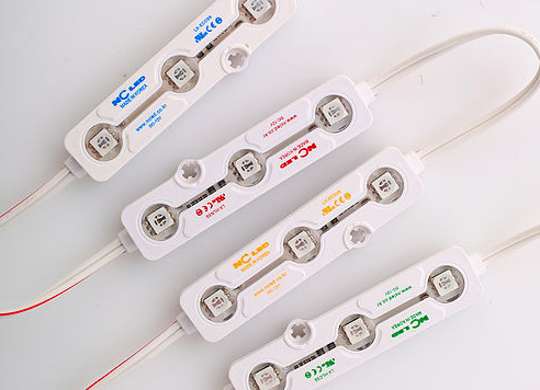
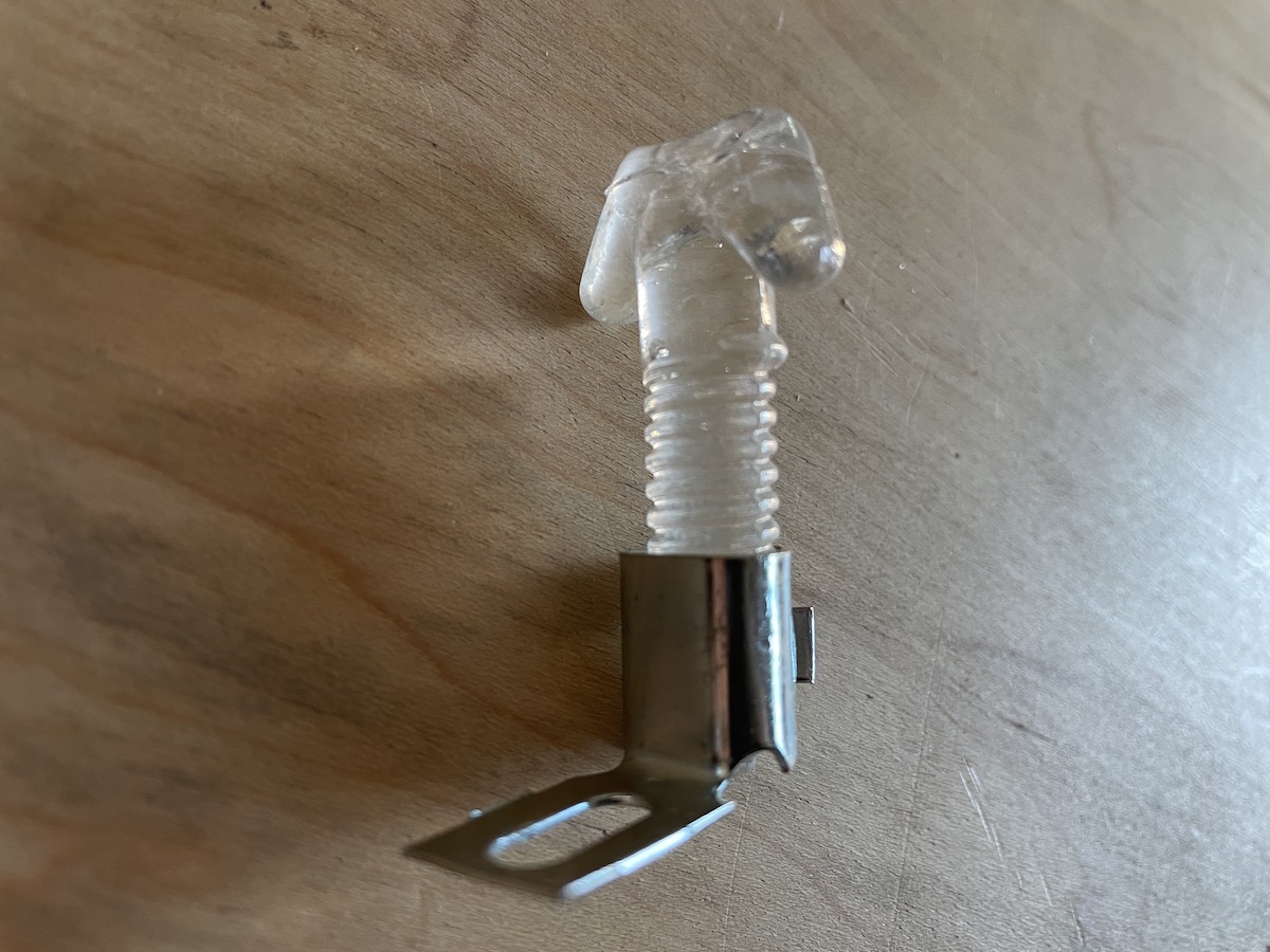
 Here's a pretty cool little project using the BrightON Lighting 3000K Mini Modules. The 3000K goes nicely with the Green
 -
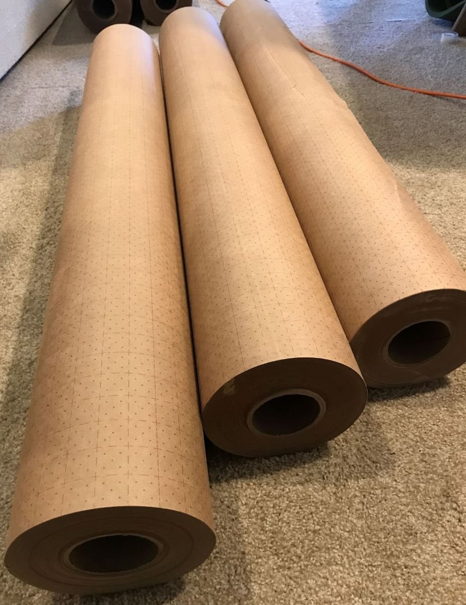
 Hi John, Are any of these still available? Would love to discuss potentially taking them off your hands.
 -
Oh yeah, much smaller than Vegas, and larger than the Atlantic Show. I usually go annually, but last Vegas show was smaller than usual and saw all in one day.
-


Recommended Posts
Join the conversation
You can post now and register later. If you have an account, sign in now to post with your account.