


-
Topics
-
-
Posts
-
 It's actually 22 gauge corrugated galvinized metal painted a Matthews Paint Green
 -
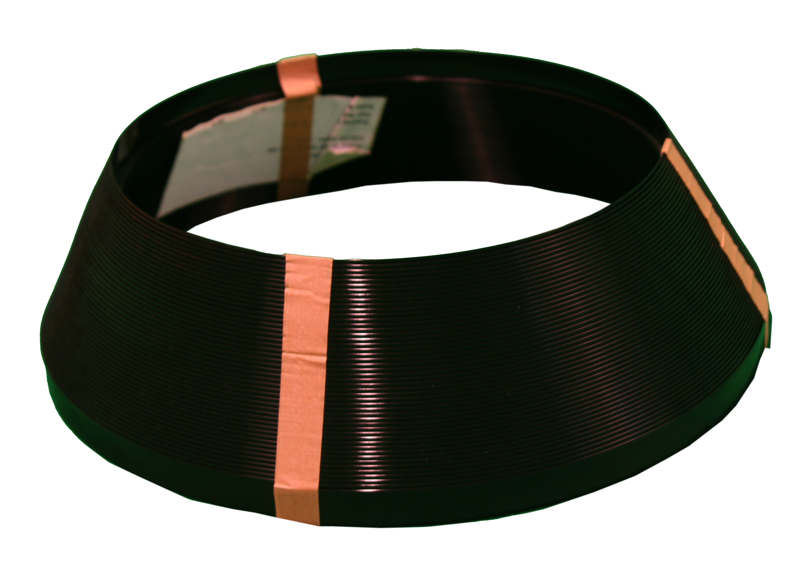
 Nice, Where did the corrugated plastic come from? I have a potential job where the customer wants to recreate his old sign that was damaged.
 -
 optimal spacing for double-sided cabinet light LEDs is crucial for balanced illumination. Consider factors like cabinet size, desired brightness, and placement to ensure even coverage. With careful planning and precise spacing, you can enhance visibility and ambiance, creating a well-lit and inviting space for any setting.
 -
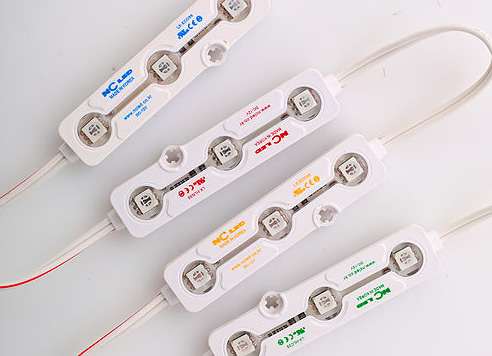
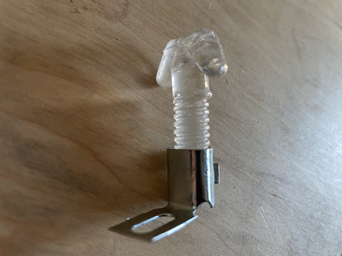
Here's a pretty cool little project using the BrightON Lighting 3000K Mini Modules. The 3000K goes nicely with the Green
-
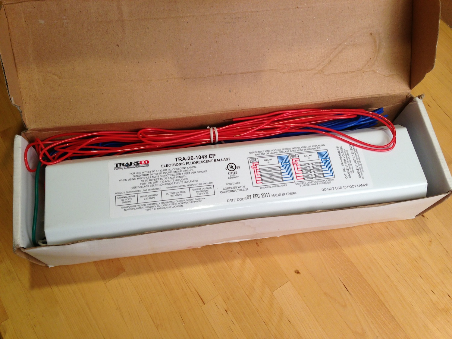
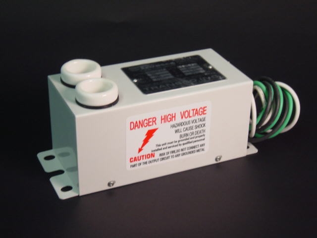
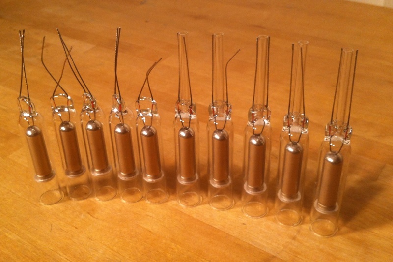
 Hi John, Are any of these still available? Would love to discuss potentially taking them off your hands.
-


Recommended Posts